ACB X
A card-battle interface built on one heavily textured plate language: decks, packs, raids and progression.
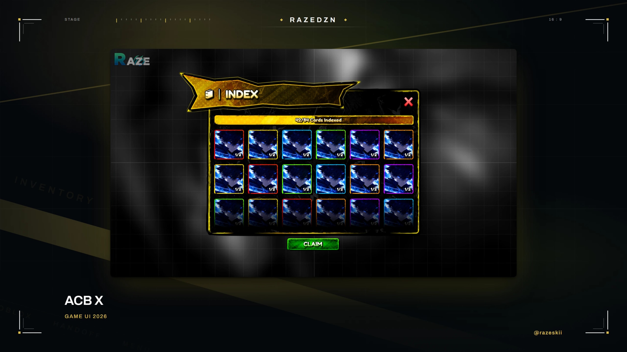
ACB X is a card collection and battle game. The art direction is dark, saturated and heavily textured, which is easy to overdo: the discipline was keeping the card grid readable underneath it. Seventeen screens including deck building, card packs, an index, raids, raid shop, rooms and worlds, all sharing one banner-and-plate system.
- Client
- Year
- Role
- Screens
Services
Direction
One banner-and-plate frame carries every screen, and the banner colour is the only thing that changes between them: gold for the index, violet for inventory, green for the shop, red for the store, teal for quests, blue for rewards. The player learns the shape once and then only has to read a colour. Underneath, the card grid stays on a flat dark plate so heavily textured art never competes with the cards themselves.
What the interface had to do
- Keep the card grid readable under heavily textured art
- One frame across every screen, distinguished by colour alone
- Rarity carried by the card frame, so no legend is needed